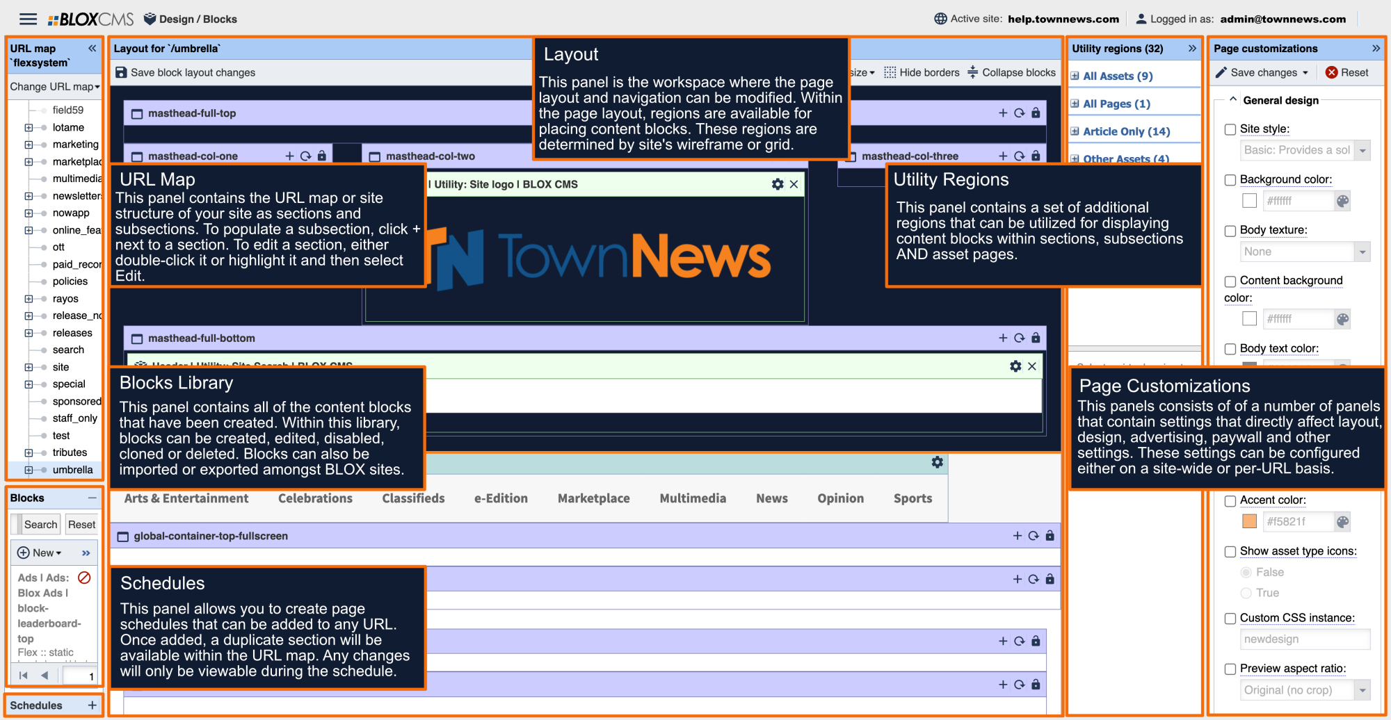
The Promo Designer block is a powerful tool that will let you showcase different email lists in multiple ways.
As with all block customizations, the main changes to how a block looks are controlled through the Appearance tab. In there, you will find multiple template customizations that will allow you to set or change what information is displayed or when it appears.
Sticker
Beginning with the Sticker option, there are four choices that you can pick from:
- Sticker Shape with the options of Disabled, Rounded Rectangle, Rectangle, or Circle
- Sticker Color that allows to choose any color by either color picker or by hex code
- Sticker icon with choices of Exclamation mark, Envelope, Question mark, Newspaper, Smartphone, Bullhorn, or Hear
- Sticker icon color, which allows you to choose either light on dark or dark on light for maximum view ability
Image
The Image dropdown gives you the ability to upload an image or logo and choose between Small, Medium, Large, Full width, or Background (full height and width).
Content
The Content dropdown allows you to set the text with marketing-friendly terms for eye-catching results.
- Lead in: Five words or less that point to the main headline
- Lead in text color: Light on Dark or Dark on Light options
- Lead in text shadow: Disabled or Enable
- Headline size: Small, Medium, or Large
- Headline Text: Allows you to write your own headline
- Headline text color: Light on Dark or Dark on Light options
- Headline shadow: Disabled or Enabled
- Main text: Enter in your main message in a free-form text field
- Main text color: Light on Dark or Dark on Light options
- Main text shadow: Disabled or Enabled
- Info text: This sets the small print at the bottom of the card
- Info text color: Light on Dark or Dark on Light options
- Info text shadow: Disabled or Enabled
Button
Next up is the Button. This allows you to link to a registration or purchase page.
- Button text: A free-form text field that allows you put marketing friendly terms such as "Sign up now!"
- Button URL: Create the link where the user is taken when the button is clicked
- Button style: Default, Primary, Success, Info, Warning, Danger, Link
- Button size: Extra Small, Small, and Large
Email Reach sign-up
The Email Reach sign-up dropdown lets you control which aspects of your newsletters you want presented, along with giving you the option to show some or all of your newsletter choices.
- Enable email reach sign-up: True/False will let users sign up newsletters through this block
- Require user account: True/False will require users to have a registered account in order to sign up
- Show "Display on signup" lists only: True/False choice that allows you to only show lists that have been designated as "Display on signup"
- List IDs: Allows you to enter the ID from an individual list, or a comma-separated group, that will be presented to users as their choices
- Maillist text color: Dark on Light or Light on Dark options
- Maillist text shadow: Enabled or Disabled
- Sign-up button style: Default, Primary, Success, Info, Warning, Danger, Link
- Sign-up button text: A free-form text field that allows you to control what the sign up button says with marketing-friendly terms
- Manage lists button text: A free-form text field that allows you to control what the list management button says with marketing-friendly terms
Interactivity
The Interactivity dropdown allows you to control when this block will surface and show its contents to users.
- Display triggers: Show overlay when visitor enters site after display timer, show overlay when the user reaches the end of content at the bottom of the page, or Show overlay when there is exit intent
- Overlay action: Centered overly, Slide-in from left, Slide-in from right, Slide-in from bottom, Slide-in from top, Toaster from left, and Toaster from right
- Display timer: Allows you to control when the overlay will appear after a certain time (in seconds)
- Display again: Allows the overlay to be repeated after a given time period (in hours)
