
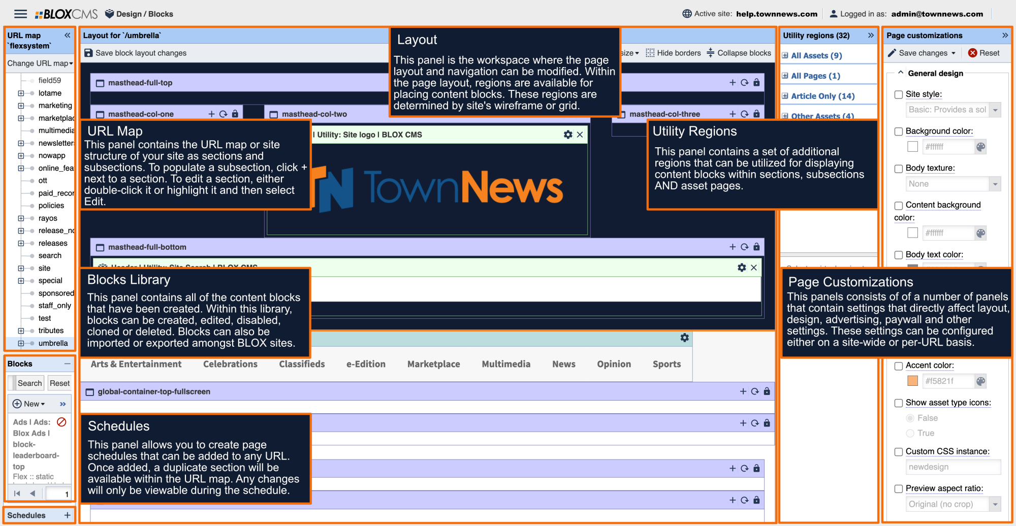
Content Block Customizations
This collection highlights the various tabs that are included with most non-static content blocks that pull content from the CMS.
The appearance tab is where you control the visual look of the block.

Block title: This allows you to enter text that will tell your visitors what content this block is showing.
Title link URL: This will turn the block title into a clickable link. Usually this is to take your visitors to the appropriate section. To do so simply enter /section to create the link. You can also link to subsections by following the URL path (/section/subsection).
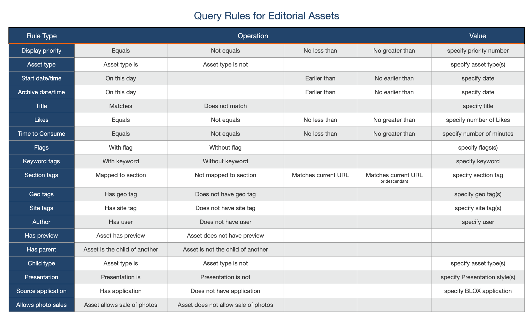
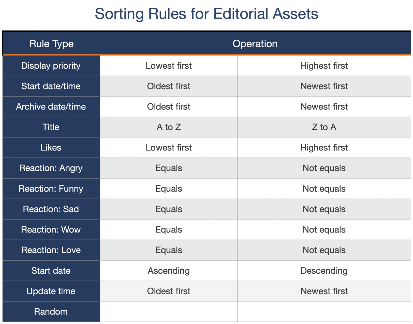
Template customizations: This is where you can affect the look of the block. Template customizations are best thought of as on/off switches. You can choose to show or hide a particular item. All template customizations fall into one of five options: a checkbox, a radio button, a hex code, a text field, or a dropdown. Most options will have a tool tip that explains what the option will do.
CSS class: This allows you to override the site CSS for this one block.


