WARNING: This requires the experimental setting, native_appman_colors, to be added to their setup before any color customizations will work.This custom must be activated by a TownNews employee.
The native app has many new elements which give it a unique look and feel. With these new elements come new customization existing within AppMan. Design choices made within Blocks customization will still have an effect at a root, section, and block level. Priority for design changes follow, where the app start on AppMan customization (if enabled) then proceed down until reaching the defaults set within app:
AppMan Customization -> Blocks customization, block level -> Blocks customization, section level -> Blocks customization, root level -> App defaults
If you (the customer) receive your native app update and the colors appear incorrect then they will need to be corrected using AppMan color customizations. The current color configuration is coming from Blocks customization or from App defaults.
WARNING: By using AppMan customizations you are forgoing the ability to override at a per section and per block level. This means you can not customize your home asset feed and your news section to have different block, card, background, etc colors. There are certain element settings you will have to use within AppMan if you wish to override them from the defaults such as tab bar. These exceptions are noted below.
Block and card Design
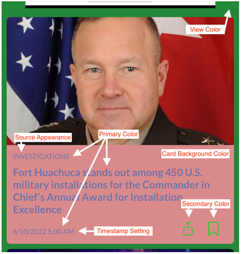
Elements found in the asset feeds are controlled with the settings under “Block Card Settings”. These elements include card design, block titles, and asset feed background (what color appears behind your cards as they appear in the feed).
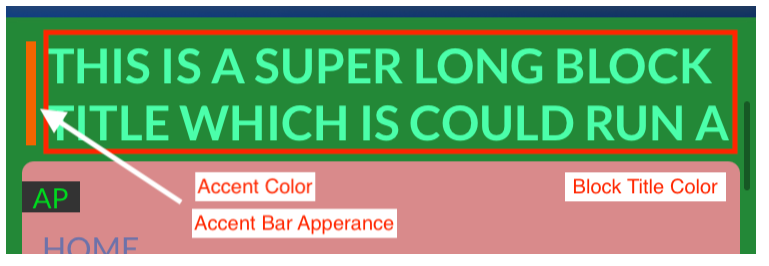
“Block Title Color” will control the text color used for block titles. These block titles appear above the start of a set of cards. A title is not required. Alongside the title is an accent bar, which can be removed, controlled by “Accent Color”
The color appearing behind your cards and in-line advertisement positions is controlled by “View Color”. The design of the card is controlled by the elements shown above in the example card. “Timestamp Setting” has three options. “Date posted” will show the exact time posted in MM/DD/YYYY HH:MM format. “Pretty date” will use logic to determine what date format to show up to 8 hours. After 8 hours a date will not show.
Pretty date logic:
If time < 60 minutes, display time in minutes (8 minutes ago)
If time > 60 minutes AND time < 3 hours, display time in hours (3 hours ago)
If time > 3 hours AND time < 8 hours, display 'TODAY'
If time > 8 hours, don't display time.
“Hide dates” will not show the date at all.
Navigation elements (tab bar and navigation bar)
NOTE: The tab bar, navigation icon, and button color customizations are only available in AppMan.
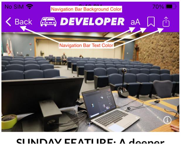
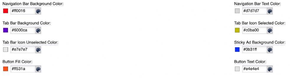
For any view where a navigation bar is found at the top of the screen, the color configuration for these elements are modified with “Navigation Bar Background Color” and “Navigation Bar Text Color”. More specifically, “Navigation Bar Text Color” will change the buttons found on article pages which control text size, bookmarking, and sharing.
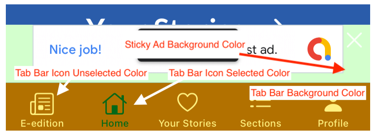
A major element of the Native app is the tab bar found at the bottom of the screen. This bar replaces the hamburger menu as the main tool for readers to navigate around your app. The tab bar disappears when a reader navigates into a section page or into an article. The main three configuration elements of this bar is the bar background color (controlled by “Tab Bar Background Color”), selected tab (controlled by “Tab Bar Icon Selected color”), and unselected tab (controlled by “Tab Bar Icon Unselected Color”).
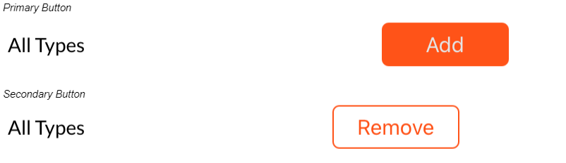
Buttons throughout the app are colored with “Button Fill Color” and “Button Text Color”. When buttons appear in groups with a primary and secondary option “Button Fill Color” will be used to outline the secondary button and the text color within the button.