In addition to a more modern user experience, the TN native app brings a new user interface for most card types. The move from hybrid app to fully native has allowed for drastic improvements on how we handle video and audio as well as creating unique experiences for article and collection pages.
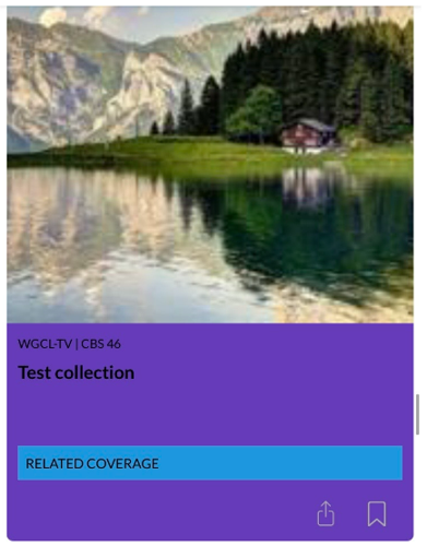
Mega Card
Add this with the “Now: Summary” block type and set the card style to “Mega”.
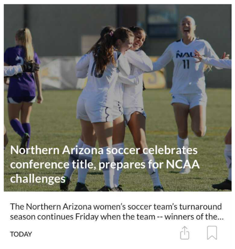
While most card types have experienced some redesign, the biggest card to be affected is the mega card. This card now features an edge to edge image with a short preview description below it. This is great for featured stories or as a way to start off your asset feed.
Headline with preview
Add this with the “Now: Summary” block type and set the card style to “Headline with preview”.
The headline w/preview card looks and feels like a more complete card than the previous version. The first two lines will show before the title is truncated.
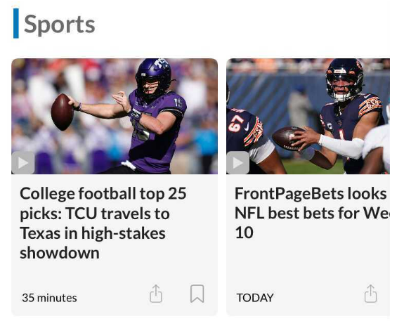
Feature
Add this with the “Now: Summary” block type and set the card style to “Feature”.
The feature card shows a 16:9 image with the title of the assets. The card does not go edge to edge in the asset feed but shares the rounded edges of the headline w/preview card, headline card, and others. It offers the share and bookmark buttons along with an optional date/time label and section label. Flags associated with assets will appear on the card.
Horizontal Slider
Add this with the “Now: Summary” block type and set the card style to “Horizontal slider”.
Our slider is designed to match a more modern style and incorporates some elements from the headline w/preview card. Each block type has an optional accent mark next to the title. This can be used to add a pop of color to your asset feed. The appearance and color of this accent mark is customizable.
NOTE: Any card with rounded edges will round on the top or left sides and pointed edges on the opposite will become a fully curved image frame if the background color is turned off. This is an intentional design choice.
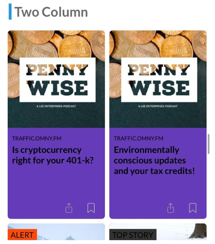
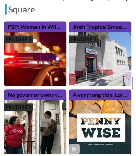
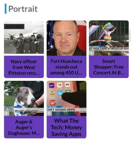
Portrait/Square/Two Column
Our grid style blocks have been updated to match the same curved design. These cards have play buttons to denote a video child asset and flags. The two column grid now has share and bookmark options.
Add this with the “Now: Summary” block type and set the card style to “Two-column grid”.
Add this with the “Now: Summary” block type and set the card style to “Square”.
Present assets with a short title, square cover image, and optional flag.
Add this with the “Now: Summary” block type and set the card style to “Portrait”.
This card is great for obituaries or mugshots where the cover image is a single headshot.
Extended Details
Add this with the “Now: Summary” block type and set the card style to “Extended Details”.
Our extended details block has been updated to match the same curved design.
BEST PRACTICE: Unless content is added to “Related Coverage” and provided alongside the main asset you should use the “Mega” card instead for a similar presentation.
Mega card slider (0.4.0 version only)
Add this with the “Now: Summary” block type and set the card style to “Mega slider (native)”.
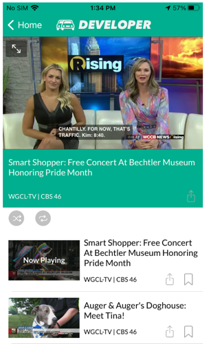
Multimedia Player
Add this with the “Now: Summary” block type and set the card style to “Multimedia player”.
The Native app supports native video by default. This means any video assets added to your feed will play using the native video player and will not send a viewer to the web. The video plays inline so an additional page is not opened to play the video. When the viewer scrolls the video out of frame it will stop playing. It also supports picture in picture (PIP) mode if the device and OS allows for it.
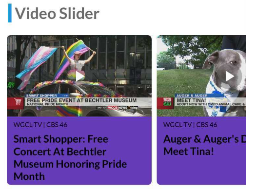
Video slider/video player
Add this with the “Now: Video Feature” block type and set the card style to “Video slider”.
Alternatively to the multimedia player card, you can present your native video assets in a slider. The video cover and title will show in a horizontal slider similar to the “Horizontal slider” block type.
When the reader clicks on an item it will take them to the video player page where the selected item will start playing in the order of the block. The other video assets in the block will appear alongside the selected item. The player will play the video assets in order of the block unless the reader clicks “Shuffle” then they will be played randomly. The player also offers the option to repeat the playlist of video assets.
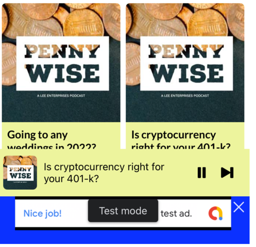
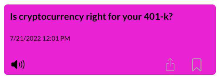
Audio Player
Add this with the “Now: Audio Feature” block type and set the card style to “Audio slider”.
Audio placed in the asset feed from search queries will play in a global audio player. The global player will follow the listener within and outside app while audio is playing. This means audio can continue to play when the listener backgrounds the app. When audio appears in the asset feed the card will be marked with a small speaker icon.
The audio asset will begin playing in the global audio player and show at the bottom of the screen giving listeners control over their audio throughout the app with the exception of article pages or video player.
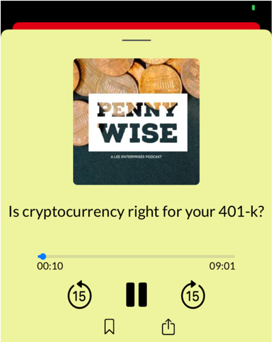
When clicked the global audio player will slide up and present the listener with full control over the navigation of their audio and presentation of the audio asset including its description and a high resolution display over the cover art. Once the audio has completed playing the audio will either stop or if the audio asset is in a block with other audio assets the next available audio asset will play.
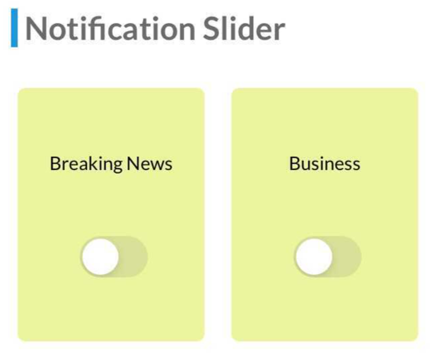
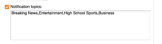
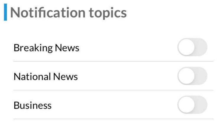
Notifications
Add this with the “Now: Notifications ” block type and set the card style to “Notification topics” or “Notification slider”.
In addition to the notification onboarding prompt, another excellent way of advertising your notification topics is by using the notification block. Topics can be displayed in a table or a slider. Each topic will appear and provide the option to either subscribe or unsubscribe depending on the reader’s current notification settings. By default, all AppMan notification topics are shown in the block. You have the option to show a subset by entering the topic title, separated by commas, in the “Notification topics” text box found in the block customization.
Continue Watching
Add this with the “Now: Personalization” block type and set the card style to “Continue watching”.
If a viewer is logged in and they have watched a video, but not to the end, then the video will appear in a horizontal slider. When the viewer clicks on the asset the video will open full screen and skip to the spot the viewer stopped watching. If a viewer is not logged in they will not see anything in this block.
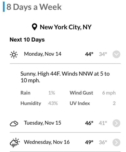
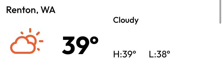
Weather - N day forecast
Add this with the “Now: Personalization” block type and set the card style to “Continue watching”.
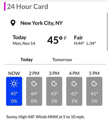
Weather - N hour forecast (0.3.0 version)
Add this with the “Now: Personalization” block type and set the card style to “Continue watching”.
Weather at a glimpse
Add this with the “Now: Personalization” block type and set the card style to “Continue watching”.
Weather - N hour forecast (0.4.0 version and beyond)
Add this with the “Now: Personalization” block type and set the card style to “Continue watching”.
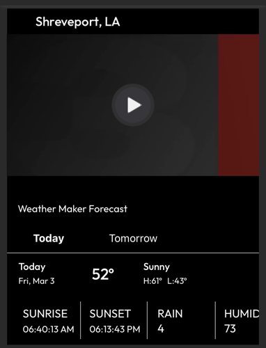
Weather - Current (0.4.0 version only)
Add this with the “Now: Personalization” block type and set the card style to “Continue watching”.
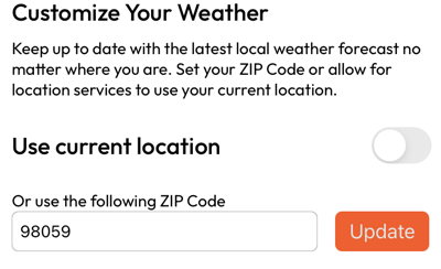
Weather - Customization (0.4.0 version only)
Add this with the “Now: Personalization” block type and set the card style to “Continue watching”.
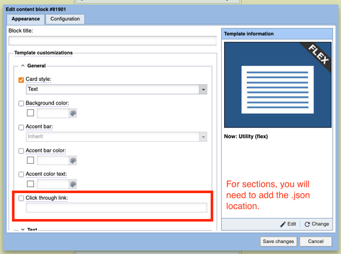
Utility card
Add this with the static “Now: Utility“ block type
The utility card is a static block to display text or an image. This block is not powered by an asset and the configuration exists only within the block configuration. To display multiple images or text messages you will need to create multiple utility cards. The style can be selected from the “General” section of the block configuration.
This block has general settings and settings specific to the style you choose. You have the option to click through to a link. This can either be a web page or a section page.
Link to webpage or section
The utility card can be used to direct the viewer to either a specific section or to a web page. This would be great for school closings, event sign up, or any place where you have information which is not flowing into the app and reader should check to get regular updates or sign up. To link off to a location follow these steps:


