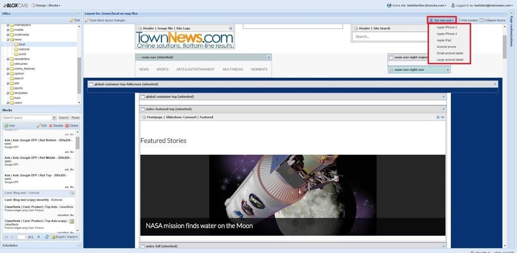
Use the Set view size button in the Blocks Manager to preview the page and blocks at different breakpoints.
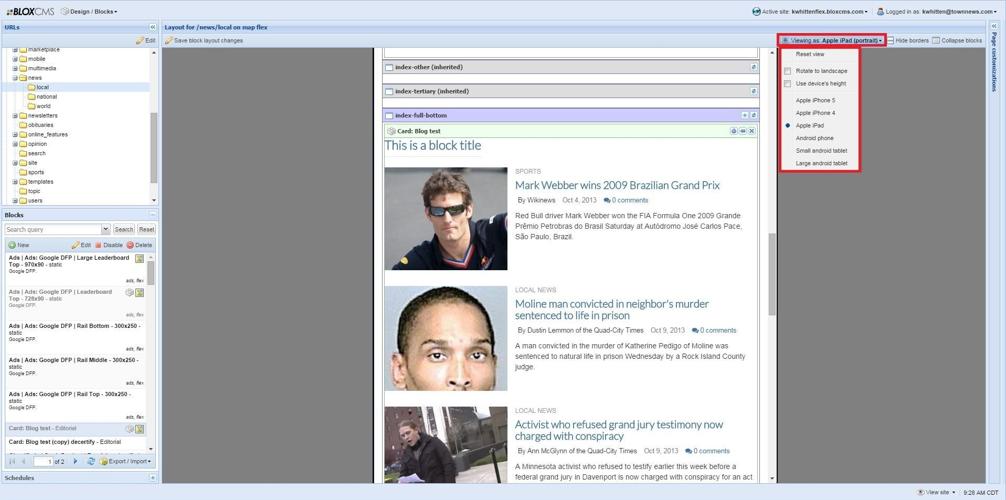
If using Set view size to view by device size, you can also change the orientation of the view.
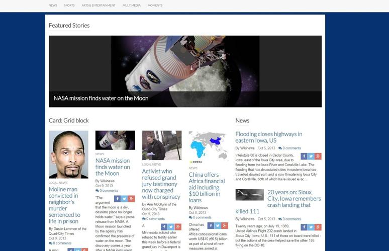
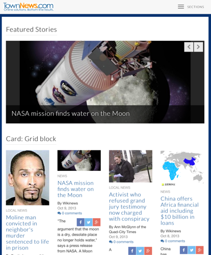
Shows how this block's information is displayed on large devices, as viewed on a computer monitor.
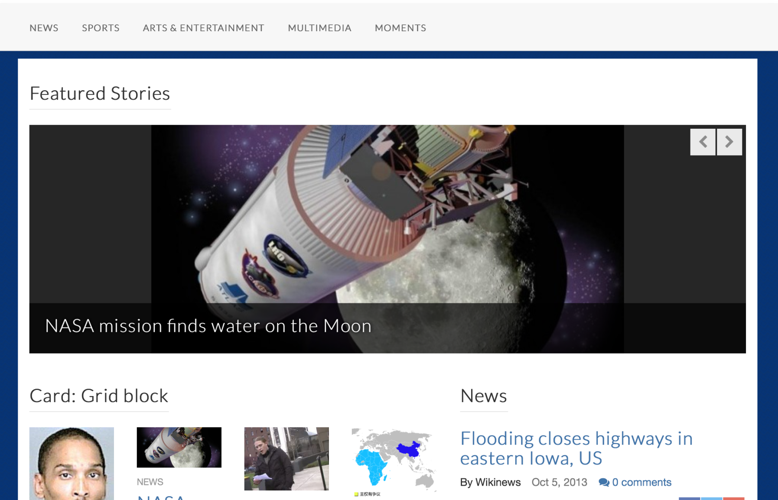
Shows how this block's information is displayed on medium devices, as viewed on an iPad in landscape orientation.
Shows how this block's information is displayed on small devices, as viewed on an iPad in portrait orientation.
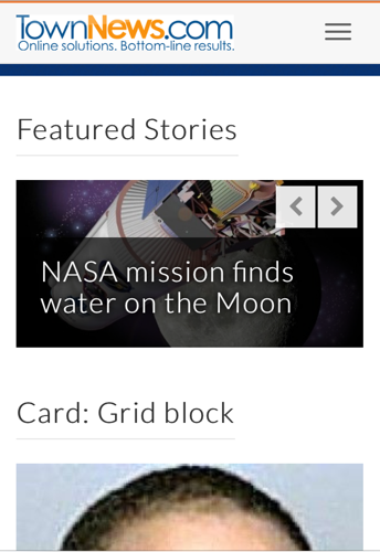
Shows how this block's information is displayed on extra small devices, as viewed on an iPhone 5 in portrait orientation.
Flex templates, Responsive Design, and Breakpoints
Flex templates are designed to make a site "responsive," meaning that the site will resize to the device it is being viewed through. This minimizes the resizing, panning, and scrolling users will have to do to read content on your site, whether they are on a mobile phone, tablet, or desktop.
In order for sites to do this fluidly, they rely on breakpoints to provide the user with the best possible layout for the device they are using. These are determined in pixels, but those pixels refer to width as a measurement, NOT in terms of resolution. So, regardless of your device's resolution, the breakpoint that you are viewing the website at will be determined by the width of your device's screen, called the viewport.
We can look at the iPad as an example of the difference between viewport and resolution, and the breakpoint at which you will view the site. The iPad 1 and 2 have a resolution of 1024 x 768 px when used in landscape orientation. The iPad 3 and 4 have a resolution of 2048 x 1536 px when used in landscape orientation. The resolution of the iPads doubled, but the screen widths (viewports) are the same, so an iPad 1, 2, 3, or 4 in landscape orientation will use the medium device breakpoint to view your site. When rotated to portrait orientation, they will access the site through the small devices breakpoint, because the screen width (viewport) changed.
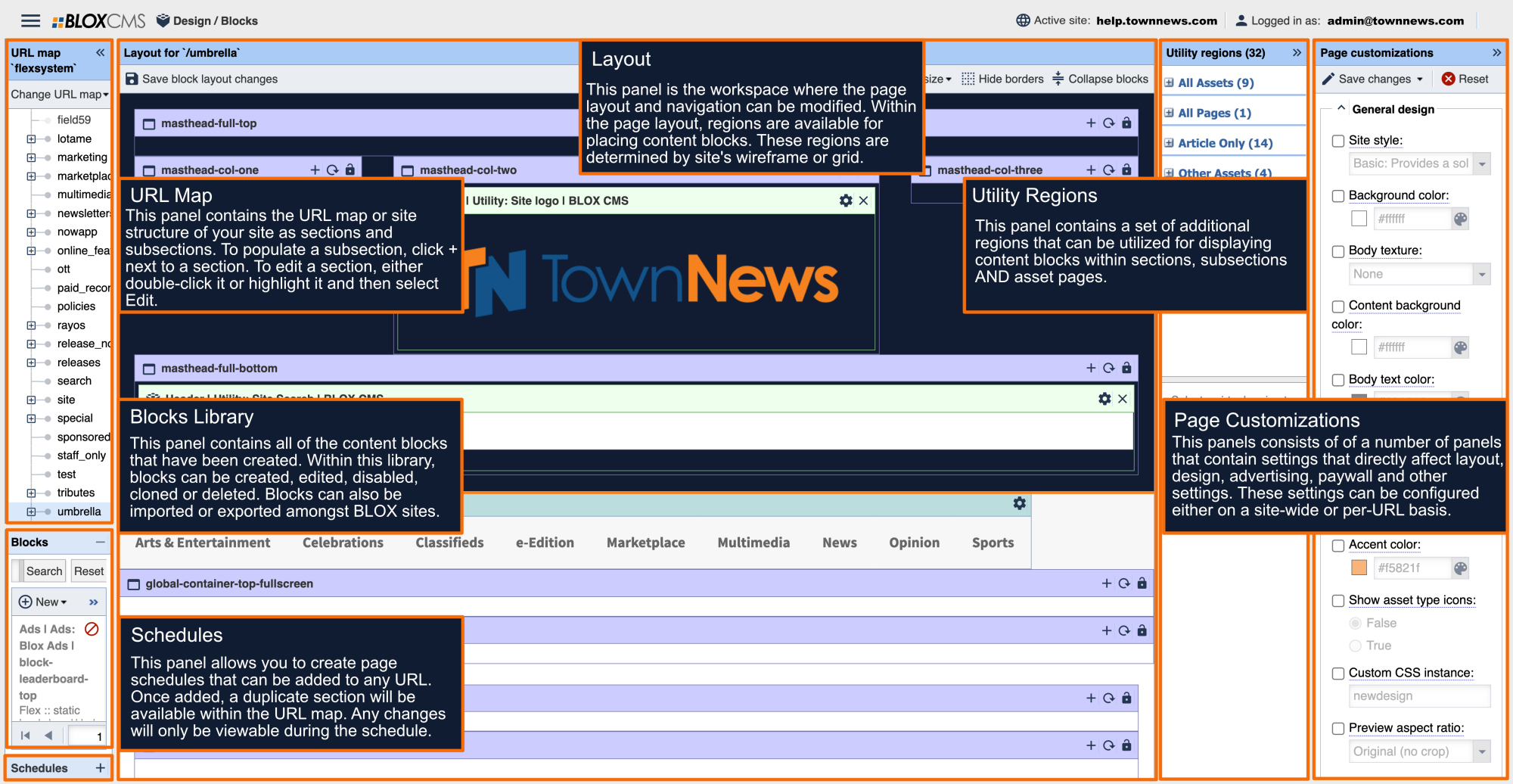
There are four breakpoints used, and these will affect the appearance of content on your site, and some things, such as navigation style and column arrangement, may change depending on viewport of the device and the corresponding breakpoint used. Flex is left column dominant, meaning that at a smaller breakpoint, the left columns will stay in place and the right columns will drop below. You can see a preview of what the page and blocks will look like at different breakpoints by using the Set View Size button in the Blocks Manager.
Use the Set view size button in the Blocks Manager to preview the page and blocks at different breakpoints.
You can also adjust the orientation of the view to landscape or portrait.
If using Set view size to view by device size, you can also change the orientation of the view.
The breakpoints are: large devices (desktops, ≥ 1200 px), medium devices (desktops, ≥ 992 px), small devices (tablets, ≥ 768px) and extra small devices (phones, < 768 px).
It is important to be mindful of the fact that your site's appearance will change depending on the viewport of the device used to access it and the corresponding breakpoint. Look at how the display of the same site and same blocks changes at the breakpoints:
Shows how this block's information is displayed on large devices, as viewed on a computer monitor.
Shows how this block's information is displayed on medium devices, as viewed on an iPad in landscape orientation.
Shows how this block's information is displayed on small devices, as viewed on an iPad in portrait orientation.
Shows how this block's information is displayed on extra small devices, as viewed on an iPhone 5 in portrait orientation.
As you can see in these examples, as the device viewport gets smaller, the way the site is displayed changes.
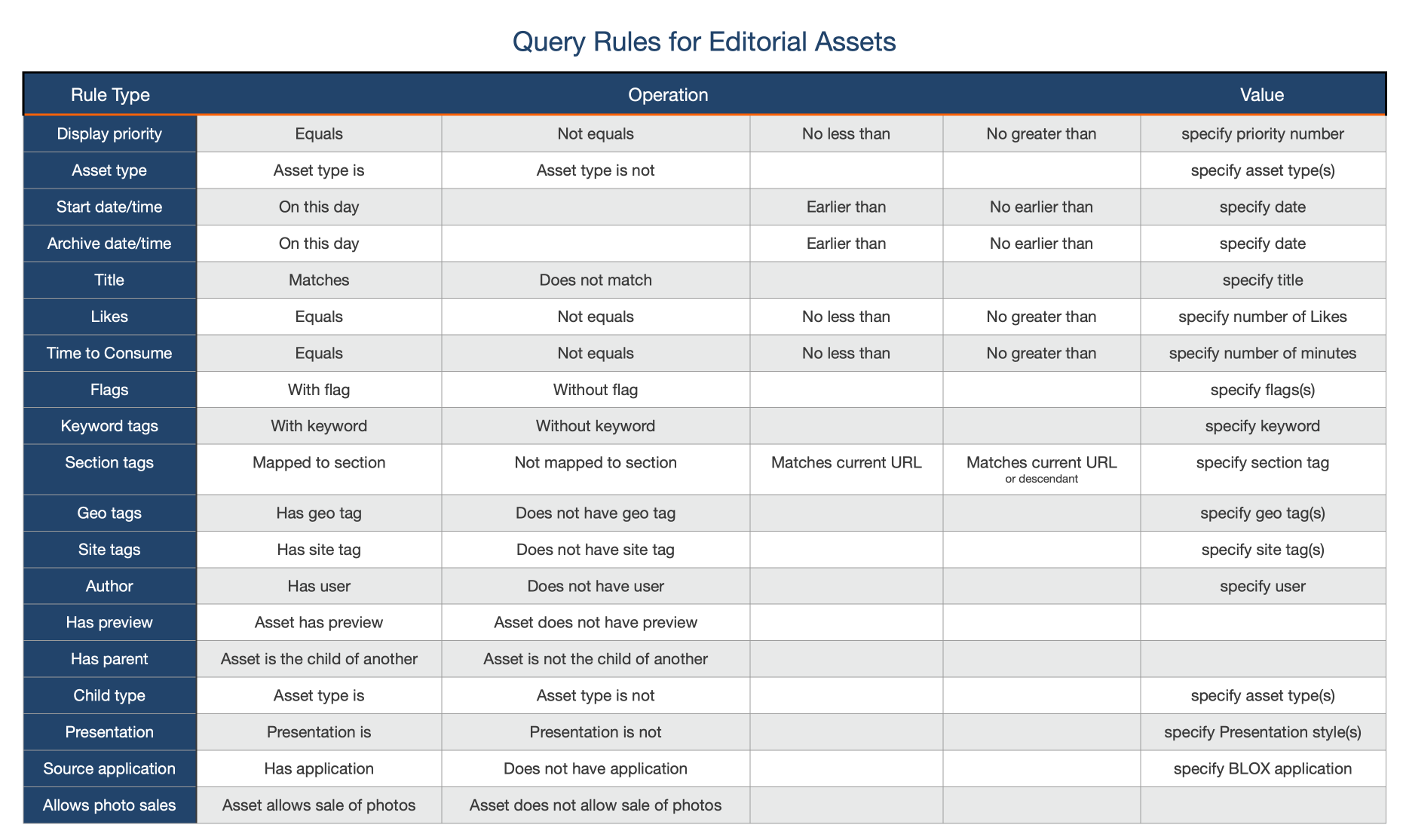
With Editorial Assets being at the heart of BLOX CMS, we strongly encourage everyone to take advantage of all help topics, but if you're looking for topic-based help topics and FAQs, we have you covered there, too.
