


All Subscription HTML5 email templates may now be edited via Subscription!
From
To

BLOX provides a basic message for those who wish to contact a business directory listing through email. If you wish to change that message you…
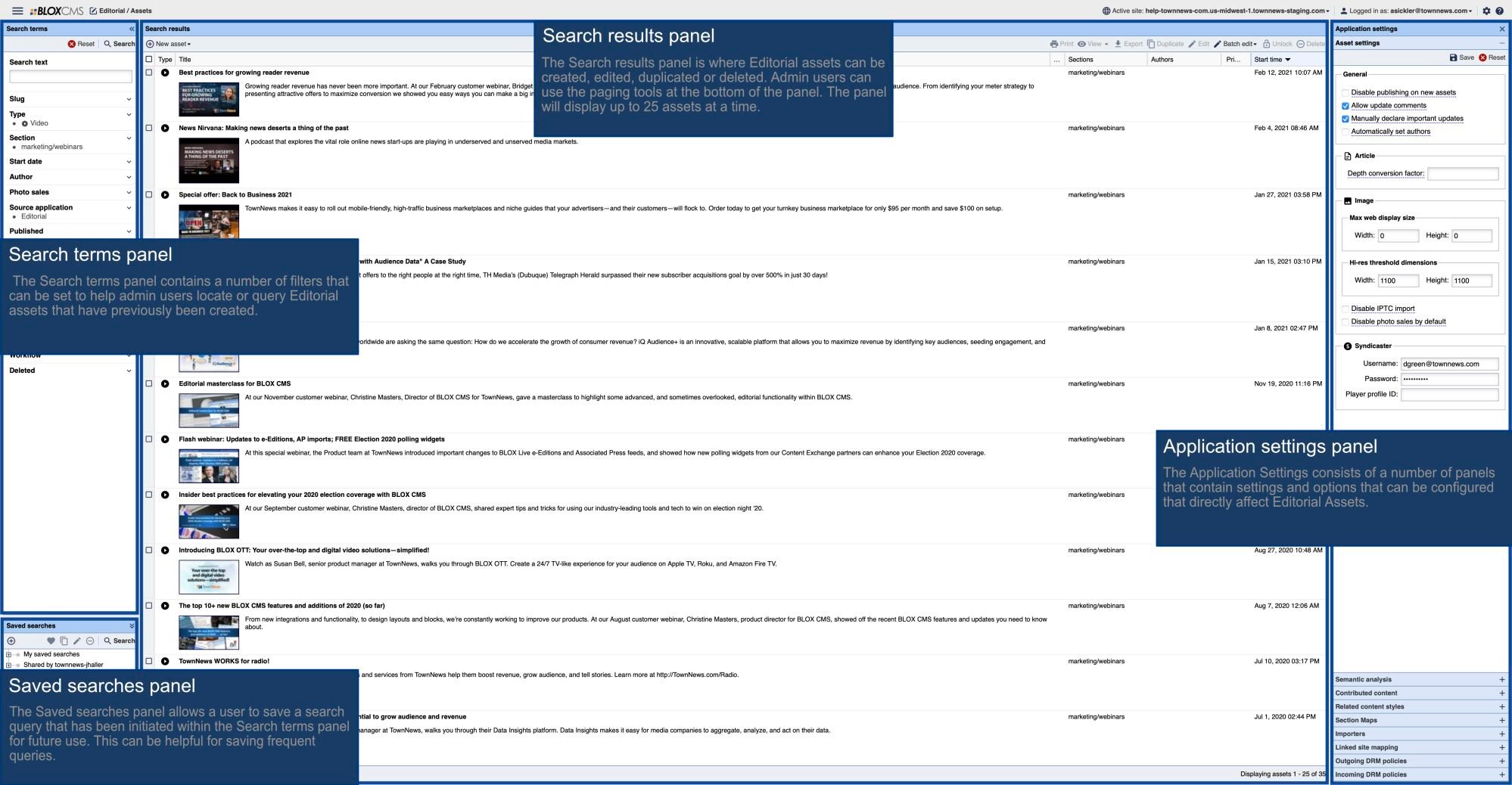
This doc covers template, block, and custom CSS and how to apply it to your Blox CMS wesbsite.

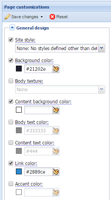
Flex templates are designed to make a site "responsive," meaning that the site will resize to the device it is being viewed through. This minimizes the resizing, panning, and scrolling users will have to do to read content on your site, whether they are on a mobile phone, tablet, or desktop.