What are wireframe grids?
The wireframe grid (or simply "wireframe", or "grid") of the site defines the basic structure of the site and where regions are placed. It also decides how the regions behave in the various response breakpoints.
Available wireframes
The Flex templates currently offer the following wireframes:
Mobile-friendly wireframes
Ample: A grid that has four repeating sections of regions with numerous opt-in points
Centerpiece: A grid that prioritizes the center column.
Mobile Pattern: A pattern grid that encourages mobile-first design.
Pattern: A flexible grid with alternating columns that repeats down the page.
Non-Mobile friendly wireframes
Banded: Three-column grid with alternating-width left regions.
Boxy: Three-column grid with two equal-width left regions.
Custom: A blank slate option delivering a custom grid definition from the opt_gridCustom macro.
Layered (BETA): Three-column grid that has repeating stacked regions for block design.
Sidebar: Four-column grid with an additional left navigation region that disappears on smaller devices.
Simple: Two-column grid with large left region and a ribbon region that breaks through the right rail.
How do I change the wireframe?
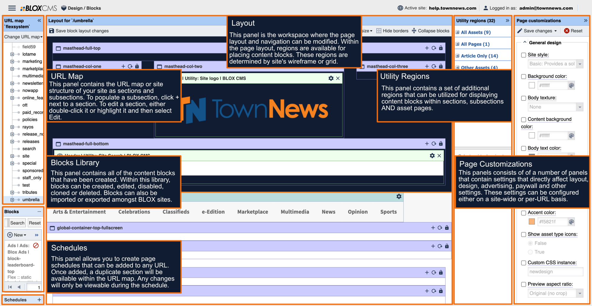
The wireframe can be changed within the Blocks Page Customizations beneath the Layout panel. The wireframe is set on the most top-level section of the site, but can however also be set on a per-URL basis.
Wireframes examples
To view examples of the framework of each wireframe and the available regions within, please view the following links:
To view examples of some of our recent site launches, please view the following link:


