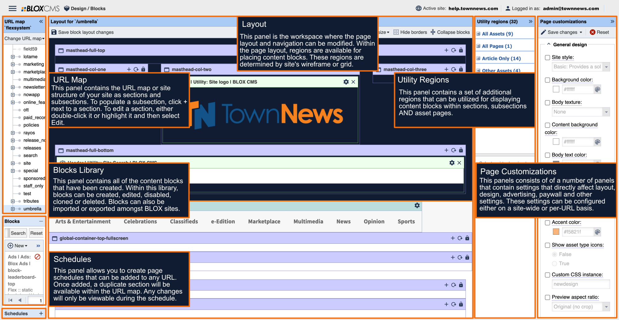
The Navigation of a site can be configured in a number of ways to best suit the site design. Just like other page layout-related tasks, the navigation itself is created and modified within the Layout panel, while the navigation options that determine look and feel are located within Page Customizations > Navigation.
Navigation should be configured on the home, most top-level URL (typically, flexsystem). Once configured, the navigation will inherit down to the rest of the URLs on the site. When a new URL or sub-URL is created, it will automatically inherit this navigation. Considering that the navigation is shared across the site, it can be modified while working on any URL and not just the top-level URL. This applies to both header and footer navigation regions.
When it comes to desktop vs. mobile navigation, these are configured independently to offer the most flexibility. Additionally, umbrella sites (or sites within a primary domain) can feature unique navigation apart from the main, primary domain.
Page Customizations
Main navigation position
This option sets the position and behavior of the main navigation. Navigation position options include:
Static: The default navigation behavior flows with the page when scrolled.
Fixed: The navigation is fixed at the top of the site at all times.
Fixed on scroll: The navigation remains static at the top of the site until scroll, and then it is fixed at the top during scrolling.
Main navigation style
This property determines the style of the main navigation. Navigation style options include:
Dropdown navigation: The various sub-menus drop down below the main sections.
Mega navigation: Large regions of content drop down below the main sections.
Hamburger navigation: A small icon reveals a slide-in navigation menu.
Dynamic navigation: Presents the best information to the user at the appropriate time.
Main navigation event style
This property defines the event used to open a link within the main navigation. Event style options include:
Hover: The navigation will react when a user hovers over a link within the navigation.
Click: The navigation will react when a user clicks a link within the navigation.
Main Navigation Background Color
This option determines the background color behind the main navigation. Leave blank for transparent. In the examples below, this value has been set to blue.
Main navigation link color
This option determines the link color in the main navigation (including active and visited links). In the examples below, this value has been set to orange.
Mobile navigation styles
This option determines the link color in the main navigation (including active and visited links). Mobile navigation style options include: Dropdown, Left menu, Right menu, Left & right menu and Left menu & right search.
Auto mobile navigation
Auto mobile navigation automatically builds the mobile navigation from main navigation menu, when using the Right menu or Left menu styles.
Working with Navigation regions
The navigation regions within the page layout can be identified by their teal color and "nav" being included within the region naming convention.
Header navigation regions
Footer navigation regions
Working with Mobile Navigation regions
While working with navigation, please be mindful to also take the mobile navigation in consideration, as they can be configured independently from one another.
The mobile layout can be modified by either shrinking the width of the browser to toggle the mobile page layout, or using one of the Set view size presets. Next, within the header select the hamburger menu. This will populate the mobile navigation regions.
A new menu can be created by following the same steps as above. Additionally, the regions within the mobile menus support assets, such as the logo in the example below.
Navigation setup
The Navigation can be setup, or modified, by selecting the gear within the navigation region. This will populate the Edit Navigation Region panel. The Edit Navigation Region panel includes the following options:
Define new navigation at this URL: Define new navigation items for this region. Identically named regions on child URLs will inherit from this. This option is typically used on the top-level URL.
Inherit navigation from parent URL: This region will use the navigation items defined or inherited by an identically named region on a parent URL. This option is typically used on umbrella sites where it's necessary to depart from the top-level navigation.
Autofill navigation from the URL map: The region will be automatically filled with the descendents of the selected URL. This option offers the ability to exclude URLs that shouldn't be include within the navigation.
Do not display any navigation at this URL: This option removes any navigation from being displayed.
Define a new navigation at this URL
To define a new navigation at this URL, select the first radio option in the list. This will populate a Menu items tab.
Next, select Blank item. This menu option provides the most options, including the ability to add a URL map link, as seen in the second tab below. This will populate the Edit Navigation Node window.
Within the Edit navigation node panel, select Link to URL map node. This will populate a Select a URL window where URL(s) may be added to the navigation (this is the same option as using the URL map links tab).
Within the Title field, make any refinements to any text as necessary. In this example, /blox_cms has been changed to BLOX CMS for better formatting. Complete this process for any navigation items as necessary.
Navigation items may be rearranged by dragging and dropping URLs within the URL tree.
Third-party navigation links can be declared by using the Link to custom URL radio option and then pasting in the appropriate URL. Select OK to complete your changes.


